7. Looking back at your prelimary task, what do you feel you have learnt in the progression from it to the full product?
When the task came about of designing and producing a music magazine my initial thoughts were that the process could be challenging this was down to the fact that my technical skills in constructing a magazine were limited. Although during the preliminary activities and right through the main task I learnt about the research process and designing a ideal magazine to suit the needs of my target audience.
The Prelimary task
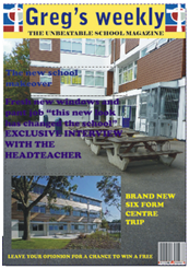
During the prelimary task I was asked to produce a front cover for a school magazine. Before the producing process I was asked to look into researching school magazine and using semiotics analyse the magazine that I researched- this is a magazine which I researched and analysed using semiotics.
The programme I used to construct my school magazine front cover was Corel Draw, this programme was used because it was the programme I would be using in my main task therefore it helped me understand how to use Corel Draw and develop my skills and understanding ready for the main task. Although before constructing my front cover I took pictures that I would use for my front cover:
The programme I used to construct my school magazine front cover was Corel Draw, this programme was used because it was the programme I would be using in my main task therefore it helped me understand how to use Corel Draw and develop my skills and understanding ready for the main task. Although before constructing my front cover I took pictures that I would use for my front cover:
 In addition I also produced a mock up of my school magazine front cover, however its evident that this mock up lacked detail and the structure in which my final school magazine was set out was completely different therefore my mock up was not need although it did help me when it came to the structure of my masthead and feature article photo. Although, the mock up was only used to show the simple positioning of the images and text so it had no major impact on the final piece.
 During the final stages of the prelimary task I began by producing my magazine front cover, now it is clear that my choice of fonts and colour was wrong and that the positioning of my images could also be changed. The magazine doesn’t look very inviting as its quite plain and boring although the only key feature which I believe made the front cover look eye catching was the bold masthead with the contrast between the font colour and the background colour. Furthermore, I also forgot to add in a issue number and a price which is a key aspect in the forms and conventions of the magazine. This is something that was crucial to add in the main task.
 I was also asked to produce a contents page for what the school magazine would look like, this was also to give an insight into helping me when it came to my main task and producing a contents page for my music magazine therefore this also helped me in my main task.
Main task
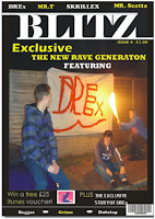
The main task consisted of me producing a front cover, double page spread and a contents page for a new music magazine. The magazine had to have a specific genre of music I went for a unique and upcoming genre of music known as “dubstep”. Throughout my prelimary task I acquired new skills in which I was able to use and address during my design and production of my main task. The programme I would be using was Corel Draw having already used Corel Draw for my prelimary task I began feeling more confident with Corel Draw this helped me massively in my design and layout of the products in a suitable way which would appeal to my target audience.
My prelimary task impacted on me becoming more aware of positioning and the contrast between the images and the text, realising that I used a picture that I used two picture that did not work well together I went for only one picture in my front cover of my main task, I aimed for this one picture to tie in well with the mast head and the text. In addition this would also make my front cover look more professional as my front cover of my prelimary task lacked the professional look about it.
Construction of imaginary entity
The imaginary entity enabled me to progress from the preliminary stages to the main task, it helped me understand who my target audience would be and what they want from my magazine. Therefore I was able to begin by producing images and text that I believed would appeal to the decoder. In addition, the questionnaire also impacted heavily on progressing from the prelimary stage to the main task. The questionnaire meant I was able I was able to get feedback from members of my class about my colour, images and the fonts I had chosen to use. This meant if there was anything the decoder did not agree with I was able to change it until it met the demand for my target audience.
Textual analysis skills
At the start of the project my textual analysis skills were limited although throughout the prelimary task and main task I have developed my knowledge on the codes and conventions. My knowledge has been developed from continuously researching and analysing magazines. In addition, from continuously looking at magazines I have become more critical I am able to pick out something I don’t like in a magazine explain why I don’t like it and state what could be done to improve it. My knowledge of semiotics has also been developed throughout the project I am now able to analyse signs and state wherever the sign is connoted or denotated.


No comments:
Post a Comment