Thursday, 26 April 2012

Audience Feedback

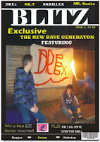
Danielle- “Your front cover is very good, I like the feature article photo it’s effective and is technical with the double image makes the picture stand out. The masthead is bold and would appeal to teenagers which are clearly your target audience. The overall background colour ties in well with your pictures and the contrast between your captions and the background text make the magazine stand out. The use of puffs is clearly shown and will draw in your target audience. Furthermore, puffs can evidently be seen as well. The main cover line however needs to be bolder and stand out as a main cover line. Overall it’s a good magazine front cover could maybe have a little more colour involved”
Ellie- “The front cover is very good, the background colour ties in well with your masthead. Your masthead is effective and bold the font is clear. I don’t like the blue text over the picture however the black and blue contrast does not look right and the blue text is hard to read in some places. However the other text conveying plugs and puffs are good and plugs and puffs can clearly be seen. A main cover line cannot be seen so is slight downfalls on your front cover. Overall it’s a good magazine with a good main article photo”
Sadie- “I like your magazine, its very well presented. And I like our masthead it stands out and reflects your magazine well. The main article photo its good with a white background anchors the text in well. Puffs and plugs are evidently shown this is good. However I feel your magazine has too much going on. But overall it is a very good front cover with a good mix of colours making the front cover stand out”
Taking these comments into account, I feel that overall my feedback is good. Any negative comments I have addressed these comments and changed what my audience believe is negative and turned into positive feedback. No further action needs to be taken, all three of my magazine productions now fully appeal to my target audience which from an encoders perspective is crucial.

Lifestyle questionnaire

Audience lifestyle- Constructing the imaginary entity


1.      Are you a female or male?
 They are male
2.      Do they live on their own? 
 No they live with their parents
3.      Do you live in a nice area? 
 the housing estate is considered as an average 3 bedroom family semi detached house
4.      Are they attending university?
Yes they are at Portsmouth university
5.      What do they do in their free time?
 in their free time they go out with their friends, to the pub and plays sport
6.      What clothes shops do they shop in?
They shop in Topman, TK max, River island and Primark
7.      How regularly do they go out drinking?
They go out to clubs and pubs 3 times a week
8.      Are they single or in a relationship?
They are single
9.      What are their favourite bands?
Modestep, Skrilex and 21 beat
10.  Where do they go on holiday?
Malia and Kavos
11.  What is their favourite meal?
 Sausage and chips
12.  What music genre do they most like?
Dubstep

Friday, 20 April 2012

Contents page- Research


During my research of my contents I aimed to research a contents page in which I believed would attract my target audience. This process allowed me to pin point exactly what I was looking for. Within a short space of time I was able to find a suitable contents page which would attract my target audience.

Research- Front Cover


This is the overal theme I wanted to go for. This conveys my overall theme and using similar codes and conventions to what I opt my front cover to look like, Furthermore this music genre is also what my genre is based on, therefore this magazine would appeal to my target audience. The difference between my final front cover production and the magazine in which I have researched is my main article photo is I have incorporated anti- social behaviour into my front cover aiming to attract my target audience.

Sunday, 15 April 2012

7. Looking back at your prelimary task, what do you feel you have learnt in the progression from it to the full product?
When the task came about of designing and producing a music magazine my initial thoughts were that the process could be challenging this was down to the fact that my technical skills in constructing a magazine were limited.  Although during the preliminary activities and right through the main task I learnt about the research process and designing a ideal magazine to suit the needs of my target audience.  
The Prelimary task
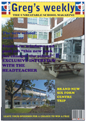
During the prelimary task I was asked to produce a front cover for a school magazine. Before the producing process I was asked to look into researching school magazine and using semiotics analyse the magazine that I researched- this is a magazine which I researched and analysed using semiotics.

The programme I used to construct my school magazine front cover was Corel Draw, this programme was used because it was the programme I would be using in my main task therefore it helped me understand how to use Corel Draw and develop my skills and understanding ready for the main task.  Although before constructing my front cover I took pictures that I would use for my front cover:


In addition I also produced a mock up of my school magazine front cover, however its evident that this mock up lacked detail and the structure in which my final school magazine was set out was completely different therefore my mock up was not need although it did help me when it came to the structure of my masthead and feature article photo. Although, the mock up was only used to show the simple positioning of the images and text so it had no major impact on the final piece.


During the final stages of the prelimary task I began by producing my magazine front cover, now it is clear that my choice of fonts and colour was wrong and that the positioning of my images could also be changed. The magazine doesn’t look very inviting as its quite plain and boring although the only key feature which I believe made the front cover look eye catching was the bold masthead with the contrast between the font colour and the background colour.  Furthermore, I also forgot to add in a issue number and a price which is a key aspect in the forms and conventions of the magazine.  This is something that was crucial to add in the main task.

I was also asked to produce a contents page for what the school magazine would look like, this was also to give an insight into helping me when it came to my main task and producing a contents page for my music magazine therefore this also helped me in my main task.
Main task
The main task consisted of me producing a front cover, double page spread and a contents page for a new music magazine. The magazine had to have a specific genre of music I went for a unique and upcoming genre of music known as “dubstep”.   Throughout my prelimary task I acquired new skills in which I was able to use and address during my design and production of my main task.  The programme I would be using was Corel Draw having already used Corel Draw for my prelimary task I began feeling more confident with Corel Draw this helped me massively in my design and layout of the products in a suitable way which would appeal to my target audience.
My prelimary task impacted on me becoming more aware of positioning and the contrast between the images and the text, realising that I used a picture that I used two picture that did not work well together I went for only one picture in my front cover of my main task, I aimed for this one picture to tie in well with the mast head and the text. In addition this would also make my front cover look more professional as my front cover of my prelimary task lacked the professional look about it.
Here is the contrast between my main task front cover and my preliminary task front cover:


Construction of imaginary entity
The imaginary entity enabled me to progress from the preliminary stages to the main task, it helped me understand who my target audience would be and what they want from my magazine. Therefore I was able to begin by producing images and text that I believed would appeal to the decoder.  In addition, the questionnaire also impacted heavily on progressing from the prelimary stage to the main task. The questionnaire meant I was able I was able to get feedback from members of my class about my colour, images and the fonts I had chosen to use.  This meant if there was anything the decoder did not agree with I was able to change it until it met the demand for my target audience.
Textual analysis skills
At the start of the project my textual analysis skills were limited although throughout the prelimary task and main task I have developed my knowledge on the codes and conventions.  My knowledge has been developed from continuously researching and analysing magazines.  In addition, from continuously looking at magazines I have become more critical I am able to pick out something I don’t like in a magazine explain why I don’t like it and state what could be done to improve it.  My knowledge of semiotics has also been developed throughout the project I am now able to analyse signs and state wherever the sign is connoted or denotated.

Friday, 13 April 2012

6.What have you learnt about technologies from the process of constructing this product?


Throughout the course of creating my music magazine I have acquired various skills, I also learnt about the wide range of different technology used in the design and producing process of magazines.  With these new skills that have acquired throughout the design and producing process these skills I will be able to use in the future. Furthermore, the realisation of how long the process is of creating a magazine I have also learnt about, before I believed the process was short and simple however, now I have realised how long and detailed every step of creating a magazine is.


Blogger
Blogger in general has been used throughout the project, all my work is displayed in Blogger, including my research, planning and the media theories therefore I have used Blogger on significant occasions throughout my project. Furthermore I have also used Blogger in other projects so the knowledge that I already had on Blogger has been developed by this project.  How has it been developed? Well my knowledge on overall presentation of Blogger was pretty slim I have now learnt how to apply templates and make my work look presentable and as interesting as possible.

I decided to use this template and background from my blog making it look presentable and easy to read.


In addition when learning about Blogger I was able to apply labels to my pieces of work, this meant that my work was sorted into different labels.  My work was split up into 6 sections that are shown below:


I also incorporated pictures into my work on Blogger therefore I learnt how to upload pictures on Blogger. This I had already done in other projects so I had no problem uploading pictures


 In addition, audience feedback is also crucial for an encoder. My audience feedback was all done through blogger.


Corel draw

During the producing process Corel Draw was the programme I used to construct my front cover, double page spread and contents page. This programme was a suitable programme to use this was because of the wide range of fonts to choose from and the different formatting I could use to manipulate a perfect magazine with different formatting within for example my double page spread I was able to use certain formatting to imbed a banner within my interview.


Within my magazine I used a variety of different fonts, corel draw offered a wide range of different fonts that I could use that were appropriate to my overall theme. When choosing a font for my masthead I was able to find a bold font style that impacted on my front cover looking bold and standing out- this was down to the fact that the font of my masthead was perfect for creating a bold masthead.  Therefore I was able to find suitable fonts for different sections of my magazine.

 In addition another key aspect of why I chose corel draw was down the fact that objects within my page was easy to move, resize and also changing the order of the objects was also easy. By the click of a button the object could easily be moved to the back of the page. This made life easy for me when I began moving objects to see how I could make my magazine look better.

An advantage to using Corel Draw, is the basis of how easy Corel Draw is to import images. When constructing my front cover this made the process of importing pictures easier and less time consuming.


Another advantage of using Corel Draw is the fact you can edit pictures and bitmaps during the process of constructing a double page spread. If  I was not happy with my image and I opted to change my image using Corel Draw I would be able to change the image.

Although there was also a few problems using Corel Draw which at times I found frustrating.  Cropping pictures on corel draw compared to a program such as Photoshop was a lot harder it took a lot of time to crop my pictures and at times I also had to re crop to make sure my pictures were successfully cropped.  Another problem I had with using Corel Draw was creating my banners (known as bitmaps) were also relatively hard to create on Corel Draw and the step by step the I wasn’t happy with the overall result of what I had created using Corel Draw so I used Photoshop to create my banners which was a lot more effective and easy to use.  However Corel Draw as a whole was a very helpful program to use.

Camera


The images that were used in my magazine were taken on a Sony Cybershot the pictures weren’t professional however were of a pretty high quality. On my front cover I took one main photo which was edited however before the project started I already new how to take photos although I had no experience of taking photos at night and I wasn’t sure on how to edit photos. Therefore the project enabled me to take photos in the dark and learn about how to edit photos. The program I used to edit my photos was http://www.picnik.com/ in addition I also used Microsoft picture manager to edit my photos.


Internet


The internet was also a significantly important in my project without the internet I would have struggled to create a successful unique magazine.  I used the internet to research about other magazines, and how they were designed.  I also used the internet to find out about the different publishing companies and how to attract my target audience.  Furthermore the internet was also used to find out anything I was unsure of such to find out what was meant by the term “Conglomeration”.  The research was essential part of my project I feel using the internet helped me massively and has also helped my understanding of the media production world.


5. What kind of media institution might distribute your media product and why?


Once my music magazine had been constructed the next step was the selecting process whereby as an encoder I had to choose the correct media institution to distribute my music magazine In terms of the distributing process of magazines the media institutions are responsible for the overall production and distribution of magazines. Media institutions distribute millions of magazines around the UK everyday.  However, the institutions normally focus on a specific type of magazine such as music. This is the sector in which I will choose the correct media institution that will distribute my music magazine.  From researching the most popular publishing houses in the UK highlighted to me which media institution was most likely to distribute my music magazine.  Furthermore, by researching on their websites allowed for me to see which magazine they published and I was able to conclude what media institution was most appropriate to publish BLITz.

The first website I visited was the IPC Media which is one of the UK’s leading magazine publications, selling over 350 million magazines every year. The brands which are published by IPC are fashion and celebrity gossip magazines such as “Look”. Furthermore it also includes TV news magazine such as “TV Times”. In addition, it also covers music magazines such as “NME” NME reaches over one million music fans every week.  And is also the longest published and most respected music weekly in the world.  Therefore I believe that publishing BLITz would be a hard task as NME is mass music based not focussing on one specific genre therefore it would have a greater target audience and a lot more consumers.


The second website I visited was the Conde Nast publishing house.  Straight away I was able to identify that this publishing house does not publish music magazines.  And was more focussed on fashion and beauty magazines therefore I was quickly able to eliminate this publishing house.
The Last website I researched was Dennis Publishing.  Dennis publishing Is an independent publisher. The company is male orientated and publishes the most popular men’s magazines in the region- such as  current affairs magazines and magazines specifically car and technology based, titles known as PC pro and Poker Player and Auto Express.  Therefore in Dennis publishing there is no music based magazine and it would be useful for them to have one this concludes I believe that BLITz is suitable for this company as it will create a new scope for the company.  And will give the company that other publishes don’t have male orientated with a wide range of magazines all based for males.  As I have already portrayed my music magazine is male orientated therefore it is suitable for this company, in addition will have no competitors within the company as this will be the only music magazine Dennis Publishing distribute. Dennis publishing are also highly suitable for my magazine as they are highly innovative marketers as well as scratch and sniff editions as well as ezines-offering online magazines.

3 concepts of media ownership
Horizontal integration is where to companies that are in the same industry merge together such as one health and fitness magazine joining up with another health and fitness magazine. This can result in their knowledge of the other company increases the chances of the public purchasing products from that company. Horizontal integration is becoming more popular in the media production.
Vertical integration is where one company owns many co-operations that work together in the media line.  Resulting in them being able to own a radio station as well as having a television channel and a magazine however all 3 types of media are all under the same name.  An example of this is Kerrang which has its own magazine and its own radio station and its own television channel, this results in Kerrang ensuring viewing from every form of media that will impact on increasing its population of readers and total viewing figures.
Conglomeration is where two companies that are part of completely different industries often join together to increase power and popularity, - aimed in the world of media.  Such as media production company joining forces with a car company, making it easy for the public to associate one with the other- aiming  to gain a wider understanding of what both companies do for each other  this could be conveyed by the media production advertising the car companies cars through either television or magazines.
4. How does your media product represent particular social groups?
Representation can be defined as the construction in any medium aspects of ‘reality’ such as people, places, objects, events, cultural identities and other abstract concepts. Furthermore, it can also be described as the ways of communicating to a decoder using signs and symbols.  Representation is important in all forms of media however in terms of magazines its crucial. After learning about the mediation process I discovered that all signs and symbols have to go through a mediation process before they are fully suitable for the encoder’s use in their media product. Therefore as an encoder I had to ensure that all signs  I selected to be constructed in my magazine had to have the best possible outcome of products that were appropriate for my target audience my rate card suggests products that would appeal to my target audience. However, as an encoder when representing particular social groups it was vital that I took into consideration my target audience’s social class.

My overall representation is denotative. This is because the pictures that are displayed all represent what the band “DREx” act like. Therefore the representation is denotated throughout my front cover, double page spread and contents page. This is because the band acts like a stereotypical dubstep band therefore there is no connation in my images.   


My music magazine represents people from a C1 range in terms of stratification. This social stratification implies that my magazine is for people with an average income.  My magazine would include music such as dubstep and drum and bass.  The magazine would also include pictures of girl models posing in sexy lingerie and advertising clothes brands.  In addition it would also include various interviews interviewing big bands- “DREx”.
All representation goes through a mediation process, where the original sign is engaged and changed until it becomes the representation the encoder chooses to use.  Although this can take a long time to get right and is based around the target audience.   The decoder’s assumptions will affect everything from the colour scheme to the design there this evident to why the process of creating a magazine takes a long time.
Social Stratification is conveyed all across the UK; every magazine company creates and publishes media products that represent a certain social group.  A magazine can represent anything from the lower class of the scale such as a “Pikey” to people of a much higher class; the scale caters for every person in society.  An encoder makes it clear to the decoder which social class the magazine represents by the signs constructed in the front cover.  In my front cover I constructed anti-social behaviour conveying that my front cover is more likely to be represented to people of a lower class. This anti social representation is used to attract my target audience because they see themselves within this magazine which would increase chances of them purchasing my magazine. This edgy representation may fit into a negative sterotyping of youth in other media because it creates a different side of youth my magazine represents the "hardcore youth"- which could be a negative sterotyping of youth. This representation allows my target audience to experience vicariously being part of a sub cultural group. 

As the encoder it was important I put my views on music and my personal message to the decoder through my magazine. My message was simple “dubstep and raving is a part of life” this bold statement that I aimed to message to the decoders of my magazine meant that I had to get this message across with the images I used unique pictures that signified the “rock and roll raving” I incorporated DJ’s and strobe lighting to get the overall rock and roll affect.  My magazine signifies a late teenage boy or young adult, which is the exact group that it was aimed at.  With this in mind this helps increase chances of a preferred reading from the decoder.

My music magazine goes against the pluralist idea that no representation can ever impact the way a decoder thinks. I believe the signs I have chosen to use in my media product show that the way in which we use the mediation process to produce something a decoder understands can have a big impact on the way my target audience will decode the signs and interpret the representation. Although there are thousands of representations of the same social group out there, produced by a wide range of different magazine companies although, I believe that my representation has unique signs making it clear to my target audience that it’s a magazine that will stand out against rival competitors.

As an encoder I also used intertexuality during the design process.  Intertexuality is the shaping of texts meanings by other texts.  As an encoder I used intertexuality to help me decide which of my designs was suitable for my target audience. I researched a wide range of music magazines that was based around similar target audiences to mine, I looked for what signs they used and put myself into the decoders perspective and began wondering why these signs appealed to me and how I could use similar signs to the magazines that I had researched.  The brief was to produce a front cover, double page spread and a contents page therefore from researching the different designs and layouts used on the magazine I was able to create my own unique design for my front cover, double page spread and contents page which I believed would appeal to my target audience.