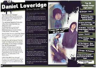
I have chosen this double page spread because its stands out to the decoder. Furthermore, it also appeals to my target audience. The double page spread conveys a sign of graffiti in addition the clothing these clusters of signs results in paradigmatic connation of the overall dubstep theme. The interpellation in the double page spread is where the bold white masthead interpellates with the statement “oh how I become famous”. The changes I will make based on this template for my double page spread will be a different layout of pictures with more people being involved in the pictures I also want to balance the text with more picture therefore I aim to break the text up and make it more appealing with bright pictures that draw the encoders attention to my boy band. The mode of address in this double page spread is using questions and answer with a colloquial language.
Although there are a few things that i would change on my double page spread, i would like more pictures it breaks up the text and looks effective, on my inspiration double page spread there are fairly any pictures so this needs to be changed. In addition, i also want to change the "top 10 dubstep songs" i believe this is not relevant to what i aim to do and readers dont want half a page of space used by top 10 dubstep songs.

No comments:
Post a Comment