My next shot goes back to the crazy look with only two members in the shot one with yellow face paint and the other with looking “normal” this photo shows the contrast between crazy dubstep and normal hip hop, the other member in the photo dressed normal will not be a member of the “DREx showing the change from hip hop to dubstep, the background will be white. This shot wil be a close up shot.
Labels
- Evaluation (7)
- Main task (3)
- Planning (5)
- Preliminary Task (2)
- Research (10)
- Target Audience (3)
Friday, 9 December 2011
Planning Photo Shoot for Double Page Spread
Thursday, 1 December 2011
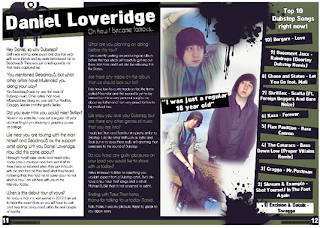
Mock up double page spread
I have chosen this double page spread because its stands out to the decoder. Furthermore, it also appeals to my target audience. The double page spread conveys a sign of graffiti in addition the clothing these clusters of signs results in paradigmatic connation of the overall dubstep theme. The interpellation in the double page spread is where the bold white masthead interpellates with the statement “oh how I become famous”. The changes I will make based on this template for my double page spread will be a different layout of pictures with more people being involved in the pictures I also want to balance the text with more picture therefore I aim to break the text up and make it more appealing with bright pictures that draw the encoders attention to my boy band. The mode of address in this double page spread is using questions and answer with a colloquial language.
Although there are a few things that i would change on my double page spread, i would like more pictures it breaks up the text and looks effective, on my inspiration double page spread there are fairly any pictures so this needs to be changed. In addition, i also want to change the "top 10 dubstep songs" i believe this is not relevant to what i aim to do and readers dont want half a page of space used by top 10 dubstep songs.
Friday, 25 November 2011
Rate card

Total Circulation# 178,121
Adult Readership# 350,000
Male 95%
Female 5%
ABC 2 Profile 65%
Average Page Rate £9500
100 pages
Percentage of advertising pages 58%
Cover price £1.80
Monthly magazine
Annual Turnover £1045913.6
5 Companies/Products that would anticipate being inrested in buying space in my magazine
Beats Dr Dre headphones
Blackberry Bold
Topman
Calvin Klein CK1
Right Guard for men
Reasons for advertising in my magazine
- These companies target my target audience therfore its an easy way to have more customers purchase their products
Monday, 17 October 2011
Thursday, 29 September 2011
Wednesday, 28 September 2011
- Throughout the magazine semiotics is evident. The striking feature article photo, makes the magazine standout, it’s bold and filled with a wide range of colours, its gives a meaning of denotation. Furthermore the Syntagmatic connotation of the feature article photo and the masthead also make the magazine eye catching.
- The main feature photo also signifies a purpose of meaning, from the picture we can see Cheryl Cole and Victoria Beckham, we straight away know the magazine will involve both of them.
- The magazine is targeted a fairly young generation the teenagers is the main target audience. This is indicated by the magazine linguistic, the language is aimed at teenagers “hot stars”.
- There is a similarity between the icon and the symbol, the icon resembles the importance of the feature article photo, where similarly the symbol is conveyed by the masthead it is the main symbol, where similarly the icon is also a key aspect of the magazine.
- The magazine signifies that there is no feud between Victoria and Cheryl. This is denoted by the cover line. The didactic cover lines also again evidently shows that the target audience is teenagers, the magazine use the didactic sign because it appeals to the reader, it suits the reader because for that target audience the magazine has to be easily read yet effective.
Monday, 12 September 2011
Analysing a school magazine front cover
- The feature article photo which takes up the whole front cover is successful in conveying the student is happy and enjoys going to school. This connates to the decoder that the school the student goes to is relaxed and she enjoys her school.
- Furthermore, the colourful fonts portray that the school is not dull and signifies to the decoder that not all schools are dull. The target audience is also clearly indicated between the school years therefore 5-18 although the plug which states "win a free ipod" anchors to the decoder that the magazines target audience is more for teenagers rather than younger children.
- The masthead however doesnt tie in well with the article there is no clear relationship between the masthead and the article therefore I believe that in this article that masthead is not appropiately used and in addition is also out of place. The masthead also needs to be more bold as the masthead is hard to read with the contrast of the school in the background.
Subscribe to:
Comments (Atom)


